April 07, 2026
Getting traffic is not the same thing as getting customers.
You can have strong SEO, decent ads, and steady clicks, then still feel like your website is not pulling its weight. That usually means one of two things is happening:
-
People do not understand what you do fast enough
-
People understand, but they do not trust it yet
-
People trust it, but the path to take action is harder than it needs to be
Below are 10 common conversion killers we see on otherwise “healthy” sites, plus simple fixes you can make without rebuilding everything.
If you want the fastest path to clarity, start with a SEO & PPC audit that pinpoints where your funnel is leaking and what to fix first.
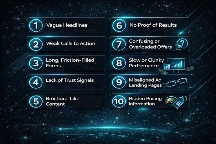
Mistake #1: Your headline is vague, clever, or built for you, not your buyer
Most homepages lead with something like “We build innovative solutions” or “Results-driven marketing.”
That does not answer the questions a visitor is actually asking:
-
What is this?
-
Is it for me?
-
What do I do next?
Fix it
Write a plain-English headline that includes:
-
who you help
-
the outcome you drive
-
what you do to get them there
If your messaging is still a work in progress, pairing content creation with conversion-first structure is one of the quickest ways to tighten it up.
Mistake #2: Your primary call to action is weak or inconsistent
If every button says “Learn More,” you are forcing visitors to keep hunting.
If every page has multiple competing CTAs, you are splitting attention.
Fix it
Pick one primary CTA per page type:
-
Services pages: “Request a quote” or “Book a consultation”
-
Product pages: “Add to cart”
-
Lead magnets: “Get the checklist”
Then repeat it after the sections where decisions happen: proof, process, pricing, FAQs.
Mistake #3: Your forms create friction
Long forms quietly crush conversion rates, especially on mobile.
Common friction:
-
too many required fields
-
unclear “what happens next”
-
no confirmation message
-
no alternative contact option
Fix it
Start with the minimum:
-
Name
-
Email or phone
-
One open field
If you are not sure what people are doing on your forms, get clean conversion tracking and reporting in place with analytics and custom reporting so you are not guessing.
Mistake #4: Your pages read like brochures instead of decision pages
A brochure describes. A decision page reassures.
Decision pages address:
-
the problem
-
the approach
-
what it looks like to work together
-
what results might be realistic
-
what risks or objections someone has
Fix it
Add two sections to your key pages:
-
“What to expect” (your process in 3–6 steps)
-
“Common questions” (real objections, not generic FAQs)
Mistake #5: You claim outcomes, but you do not prove them
“Trusted,” “proven,” “high-quality,” and “results-driven” do not reduce risk.
Specific proof reduces risk.
Fix it
Add at least one of these to every high-intent page:
-
testimonials with specifics
-
case studies
-
logos
-
screenshots of real work
-
before/after examples
If you want examples of proof that is framed around business outcomes, browse some case studies section and model that structure.
Mistake #6: Your offer is overloaded or unclear
When you list 15 services equally, visitors do not think you do more. They think you are unfocused.
Fix it
Group your offers into 3–6 clear buckets and add “best for” guidance.
If you do SEO and paid ads, separate them clearly with a short “when to choose this” note, then route people to the right next step like search engine optimization services or paid search services.
Mistake #7: Your site is slow, clunky, or stressful on mobile
People do not announce when a site feels slow. They just leave.
This gets worse when traffic comes from social, because visitors are often on mobile, moving fast, and not emotionally invested yet.
Fix it
Prioritize:
-
image compression
-
fewer heavy scripts
-
cleaner navigation
-
buttons that are easy to tap
If you need help tightening performance and UX without a full rebuild, start with web development services and target the pages that matter most.
Mistake #8: Your ad traffic lands on the wrong page
If your ad promises something specific, and the visitor lands on a generic homepage, you just created instant mismatch.
Fix it
Create landing pages that match intent:
-
one offer
-
one outcome
-
one next step
When paid traffic is part of your mix, aligning the landing page to the campaign is core to effective PPC management.
Mistake #9: You hide pricing and hide process, so people assume the worst
You do not have to list exact pricing to remove uncertainty.
Most people just want to know:
-
how pricing works
-
what affects cost
-
what a typical engagement looks like
-
whether you are in their range
Fix it
Add a short “How pricing works” block, or at least a “starting at” range where possible.
If you want a transparent example of how an agency can present pricing without playing games, Click Mentality keeps pricing public on the rates page.
Mistake #10: You are not tracking the actions that matter
If you only track traffic, you cannot tell what is working.
At minimum, you should know:
-
which pages drive leads or sales
-
where people drop off
-
which campaigns drive high-intent actions
Fix it
Set up clean event tracking and reporting, then build a simple monthly rhythm around it.
This is exactly what analytics and custom reporting is designed for: a leadership-ready view of what changed, why it changed, and what to do next.
A quick way to use this list
Do not try to fix all ten.
Pick your top 3 pages by traffic, then ask:
-
Is it clear?
-
Is it trustworthy?
-
Is it easy to take the next step?
Fix the biggest friction point first.
If you want the “tell me what to fix first” version, start with a search performance audit and use it as your prioritized punch list.
If you are ready to talk through your highest-impact fixes, use the contact page to get the conversation started.